When you first start the applet, you should choose the data set from the Choice in the upper left hand corner:
- GCO-SRT (from the SRT at Grove Creek Observatory)
- ISGHcube (from the SRT at ISU near Strasbourg)
- GCO-SRT/ISGHcube (all data combined)
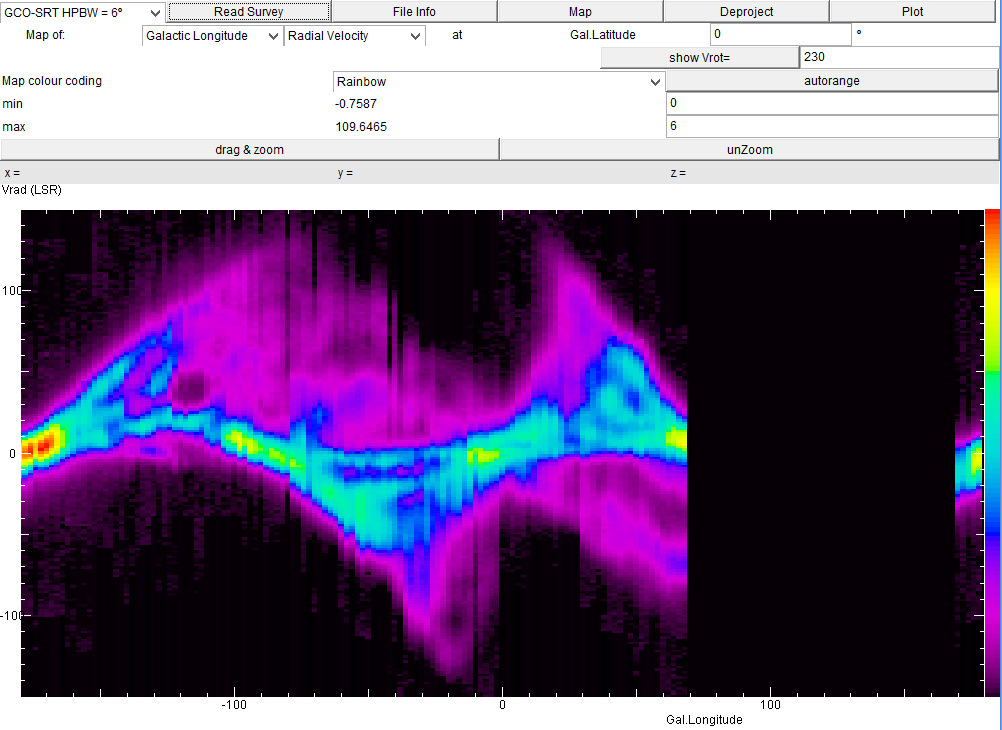
It shows the intensity of the radio emission - coded as rainbow colours (with yellow and red meaning high values) - as a function of the galactic longitude and the radial velocity, for a constant galactic latitude. Thus we see the hydrogen gas in the galactic plane, moving at a wide range of velocities: at l=-100ş and l=+30ş there is gas moving away from us with positive velocities up to 150 km/s. At l=-20ş and l=+70ş there is gas coming towards us with speeds of 100..150 km/s. As these are data from Australia, there is a gap between longitudes 70 and 170, which is not observable from the southern hemisphere.
Click with the mouse on any point of the map will display the x and y coordinates of the point, as well as the intensity (as z).
You can zoom in on any part of the map: click drag & zoom, then drag the mouse over the rectangle you want to display. To get back to the full view, click unzoom.
You can make false colour maps for any two of these parameters
- Galactic Longitude l
- Galactic Latitude b
- Radial Velocity v
To find out where in the sky there is high-speed gas going away from us, we can create a Longitude/Latitude map for a speed of +100 km/s:
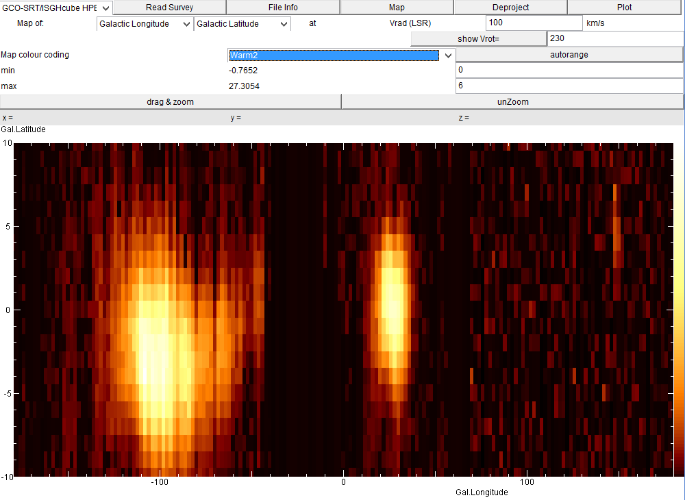
Here we also chose the 'Warm2' colour palette, which shows the most intense parts in bright orange.
You can select among a number of colour palettes, but also decide to display only a certain range of values, rather than the entire range between minimum and maximum values, as displayed. Click on autorange and enter the appropriate values.
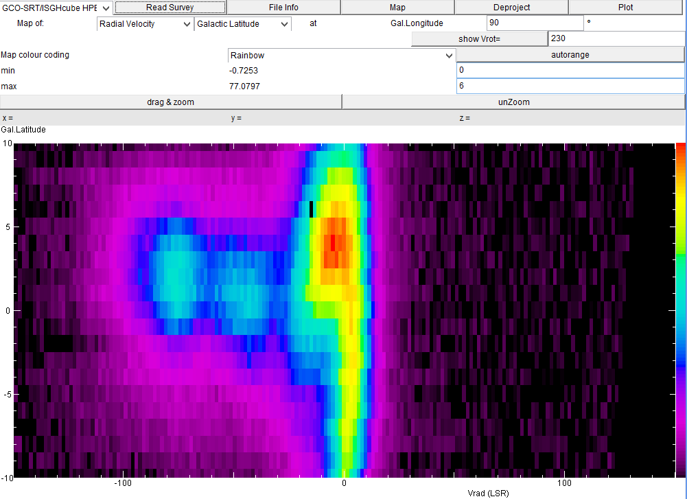
Another useful way to look at the data is to make a velocity-position map:
In this view at longitude 90ş we see that there is a lot of gas with near-zero
velocities. This is gas of the solar neighbourhood, which travels along with us.
It is present not only in the Galactic Plane (b=0ş) but also at higher latitudes.
One may trace it far above the 10ş shown here: this gas is close to us and all
around us, or we are in the middle of it! However, we notice two blue blobs of
emission at about -40 and -75 km/s. This is emission from gas in the spiral arms
further out. The emission is concentrated in a small region in latitude, which
indicates that the spiral arms stay close to the Galactic Plane. But we already
notice that the -75 km/s spiral arm (which is further away) is somewhat above
the Galactic Plane: the disk of our Milky Way has a warp.
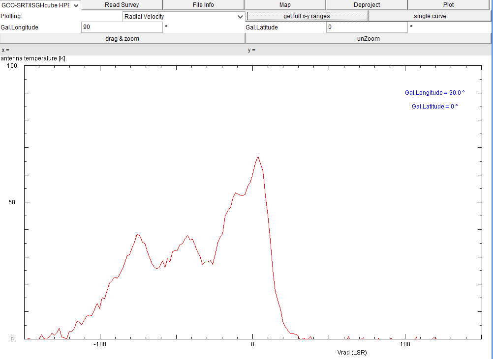
A more detailed way of looking at the data is to plot the intensity at a
function of radial velocity but at one position in the sky:
You can zoom in on any part of the plot: click drag & zoom, then drag the mouse
over the rectangle you want to display. To get back to the full view, click unzoom.
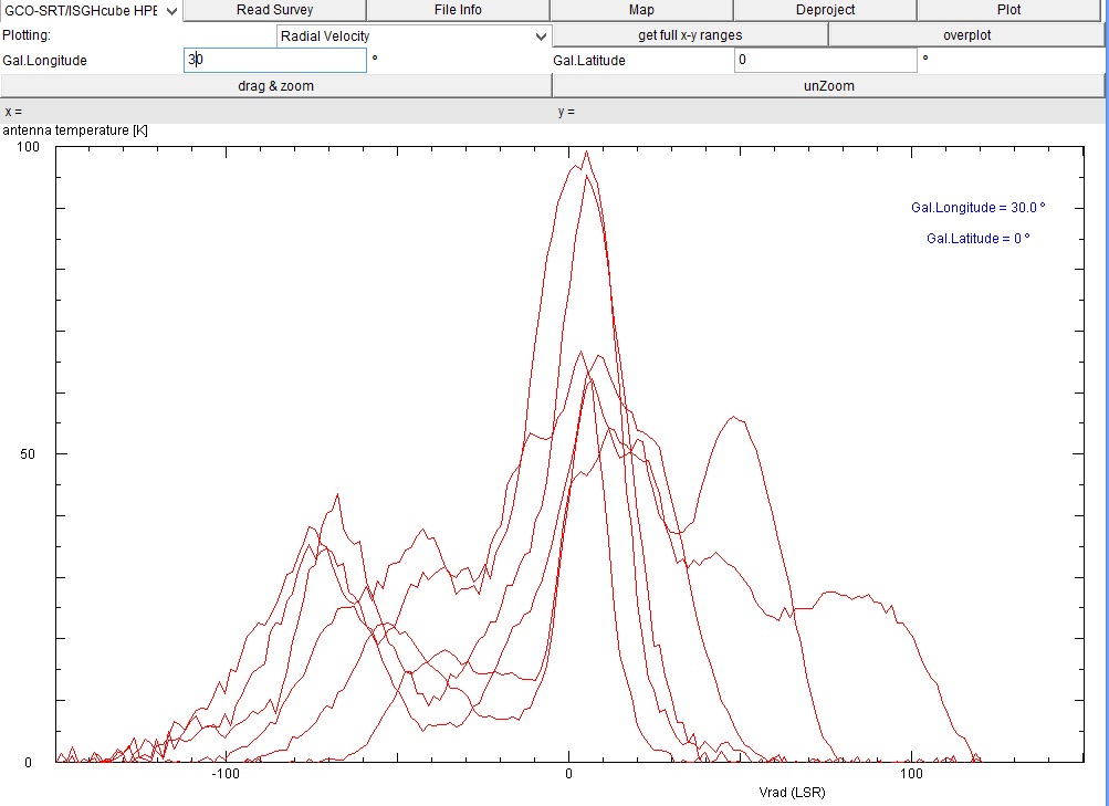
Sometimes one wants to compare the spectra of different galactic longitudes, one may do so by
clicking on single curve. Now one can overplot as many curves as one wants,
for instance here are all spectra from l=90ş, 80, 70, ... to 30ş:
This also works for a zoomed view on a plot. With get full x-y ranges the
normal display is re-established. Please note that this pertains only for the last
curve ...
You may chose as x-axis any of the three parameters.
| Top of the Page
| Back to the MainPage
| to my HomePage
|
last update: March 2014 J.Köppen DF3GJ
Click with the mouse on any point of the ploy will display the x and y values of the point.