- The data file
- First analysis
- The station gain
- Analysis of the complete pass
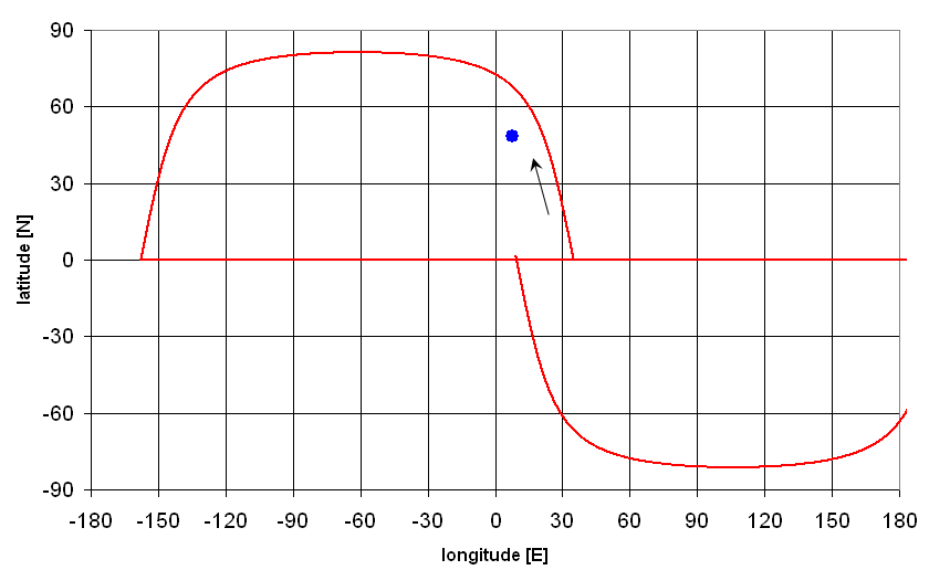
- download instructions to predict satellite positions during a pass
- Alternative Approach: using the Worksheet
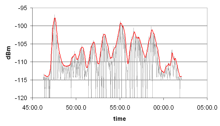
- Analysis with enhanced appearance
- Results and Conclusions
The data file
The record file looks like this
As indicated in the header, the first column is the time, and the third is the
signal power, measured in dBm, i.e. deciBel with respect to 1 mW. The second column
is the number with which the receiver coded the signal strength. It is of no
importance for us.
The data can be analyzed with Microsoft Excel or a similar program.
Import your file into the program. Under Excel you go to: File -> Import ->
TextFile -> Select your TextFile -> Delimited Textfile -> Delimiter is spaces -> Finish
It is a good idea to change the Format of the first column to mm:ss.0 so that
we do not lose the fractions of the seconds!
The next step is to make a simple plot of the signal power as a function of time.
It is best done as a scatter plot, where the first column serves as the x-axis, and
the third as the y-axis. We also recommend to switch off the symbols marking each datum,
and use a fine trace for the curve only. This will show better all the structure
in the signal.
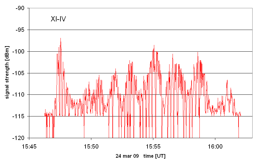
First analysis
In this example of XI-IV data we see
From the maximum signal, which would normally occur at minimum range, we can
now use the link budget to work out the power of
the satellite transmitter.
Station gain
With our software we measure the level of the signal at the antenna socket of the
receiver. This is not the signal power picked up by the antenna, because there are
the losses in the cable to the roof, the mast-head preamplifier, and the antenna
has a cetrain (pattern) gain with respect to an isotropic antenna. We may take all
these factors together and define a "station gain". The technical specifications
for our ground station give this theoretical value for 430 MHz:
In winter 2011, Feng-Lei Wu observed several passes of the cubesats XI-IV and
Cute-1, and carefully measured the signal strengths of their telemetry beacons.
From his data he established these values of the station gain:
As it is unlikely that the transmitter power of a satellite becomes higher with
time, and as the value obtained with Cute-1 is closer to the theoretical value,
we believe that our ground station has a measured gain of +33.0 dB.
We recommend to use this value in your analyses and enter it in the PassFinder
applet to get the predicted signal powers. The remaining difference of 3 dB could
well be the sum of all additional losses from the connectors and the uncertainties
in the calibration of the measuring software.
Now that we have established a good value for the station gain, we can try to
measure and monitor the powers of satellites: The above values also show that signal
strengths of the two satellites differ significantly, by 3 dB. It appears very likely
that the transmitter of XI-IV is really lower. It nominal power is indeed 80 mW (+19 dBm).
May be this has come down by another 2 dB since its launch in 2003 ... From a single
observation of XI-V, Feng-Lei estimates a transmitter power of +15 dBm (32 mW), whereas
its nominal power should be the same as that of XI-IV.
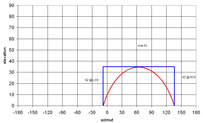
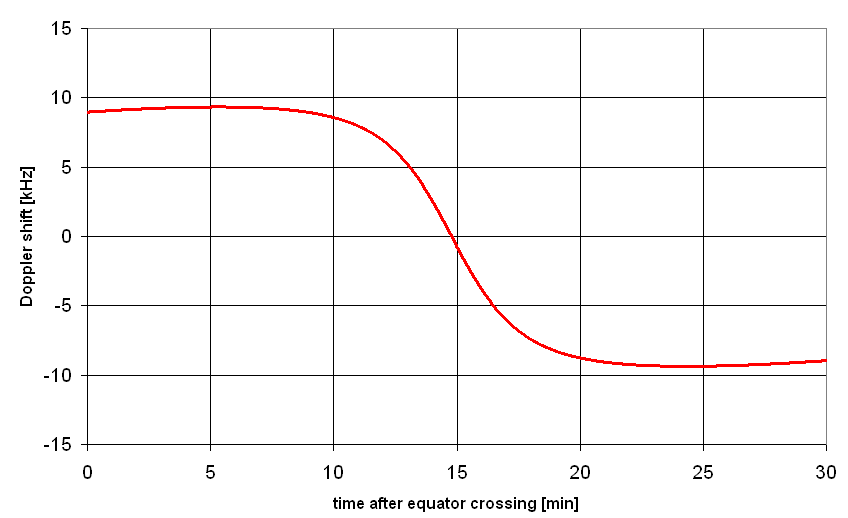
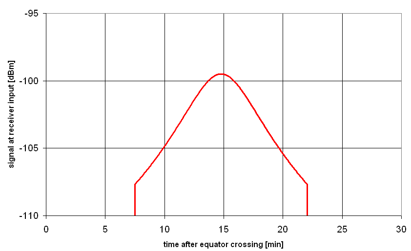
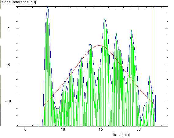
Analysis of the complete pass
Let us carry our analysis a bit further, by comparing the measured curve of
signal power as a function of time with the curve predicted from the link
budget and the range-time relation computed from the orbital geometry.
You have three possibilities:
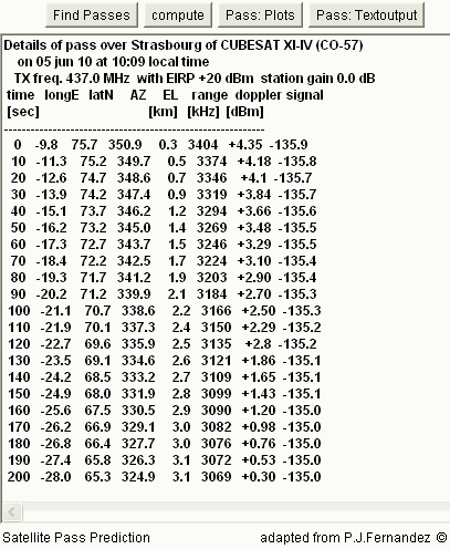
Let us use the first option: compute with the PassFinder applet
the passes predicted for the satellite on the day of observation.
Also enter the correct value for the station gain. Then click
Pass: Textoutput and use the buttons next pass and
previous pass to choose the proper pass. Please note that the times are
given in local time (CEST)!! Then you will get this table in simple ascii text:
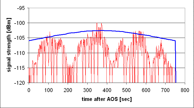
It is a good idea not to plot the predicted data straight away, but to allow that the
predicted curve can be shifted in time as well as in the power level. In this way you
can correct for some delay of the observed data in case the recording was did not
start right at AOS. Similarly, you can modify the predicted signal strength in case
the real transmitter power might differ from the one assumed in the predictions.
Therefore create two cells which contain the values for the time and power shifts,
and then create two new columns which contain the predicted times plus the
time shift, and the predicted powers plus the shift value. These two columns
you then add to the plot of the measured signal strengths, to get a plot like this:
Now we have to see what can be deduced from this comparison:
see the results for our example pass
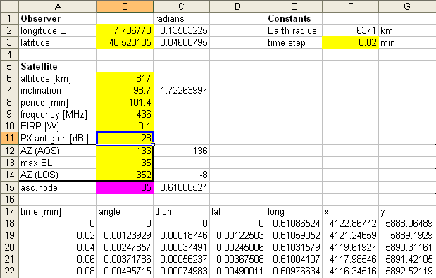
Alternative Approach: using the Worksheet
You might instead use our worksheet: in the yellow cells you input all the various
parameters. It would look like this for our example of the XI-IV observation from
24 march 2009:
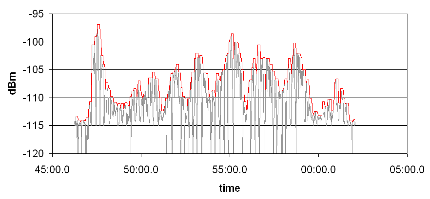
Analysis with enhanced appearance
The measurements were taken every second (as set and indicated by the software),
but we are not interested in the ups and downs between the Morse code beeps and
the pauses in between. What we really want is an upper envelope of all the curve
peaks ... so we may improve the appearance of our measured data:
We proceed in two steps: First, we fill the column D with the maxima of a number,
say 5, of the preceeding values in the signal powers in column C. For example,
in D100 we put the formula
In this example of XI-IV data we see
Results and Conclusions
Whatever method you apply, for a direct comparison with the observed data, you
make the appropriate links to the worksheets with your measurements and the
predictions. We have performed the analysis with the complete 'cosmetics'
using a different program and obtain this plot:
| Top of the Page
| Back to the MainPage
| to my HomePage
|
last update: Apr. 2013 J.Köppen
#S-meter readings
#Start at: UT 12.04.2010 20:42:24
# time[UT] s-value dBm
20:42:24.820 49 -112.67
20:42:24.920 58 -112.22
20:42:26.021 125 -107.66
20:42:26.122 140 -106.06
20:42:27.223 152 -104.33
20:42:27.323 221 -103.36
20:42:28.425 238 -103.2
In both values one has to add an estimated uncertainty of +/-1 dB for the calibration
of the receiver ... with a signal generator that had not had a recalibration for
several years. Also, we assume 0 dBi for the satellite's antenna gain.