Explanations for SkyPipePlotter Applet
Joachim Köppen DF3GJ Kiel/Strasbourg/Illkirch May 2004
Contents
How we start:
When the applet comes up, we no choice but to Click to start
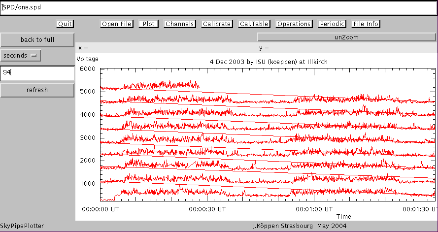
Then the default file is loaded and displayed:
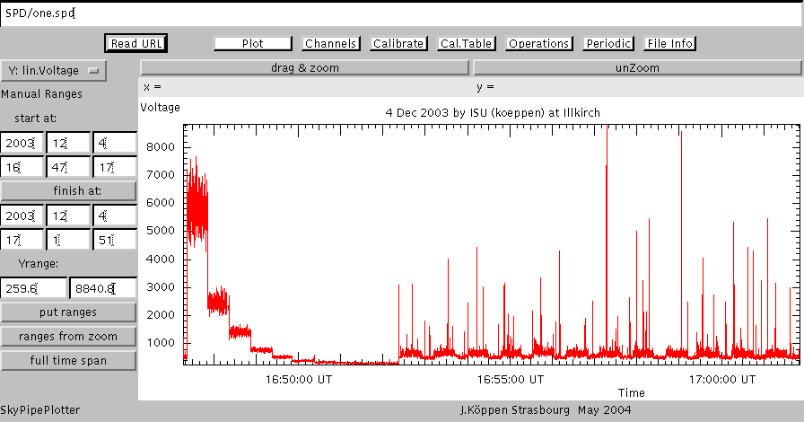
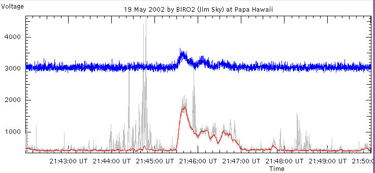
On the left hand side is a calibration sequence, on the right a periodic signal.
Though it looks interesting, it unfortunately is local night-time interference
which we are still busy hunting down!
To the top of the screen you'll find the name of the current file, and just below
there are a number of buttons for navigating between the various pages.
These are described below.
The Plot page
- drag & zoom
- click on this Button, then drag a rectangle from upper left to lower right
over the plot area which you want to zoom in. Releasing the mouse button
will display the zoomed view.
- unZoom
- will switch back to the full view.
- Y: lin.Voltage
- This Choice selects between the various ways to present the data:
- linear voltage: the normal way to show SkyPipe data, i.e. in linear
amplitude of the audio voltage coming out of the sound card
- log(voltage): the logarithm of these values. This is useful when
we want to show strong signals but also details of weak ones.
- dB(kT0): only after
calibration, the signals can be shown in noise
temperature taken in decibels above room temperature (293 K).
- kK: this displays the signal as noise
temperature in thousands
of Kelvin
- Manual Ranges
- In the beginning, the TextFields display the dates and times of the start
and the end of the plotted observations, and the minimum and maximum
voltage value.
We may change these values, and by clicking put ranges the
plot is done with the new values.
- finish at
- can be clicked to give finish after which then refers to the time
span of the displayed data
- put ranges
- forces a redisplay with the current plotting ranges. These new
plotting ranges then are used as the full view
- ranges from zoom
- reveals the ranges in x and y shown by the currently used
zoomed view
- full time span
- reveals the entire time span of the data read from the file.
If you click put ranges the plot will show the entire data.
- x = and y =
- when you click with the mouse at any point of the plot, the
time and the y-value will be displayed (not shown here)
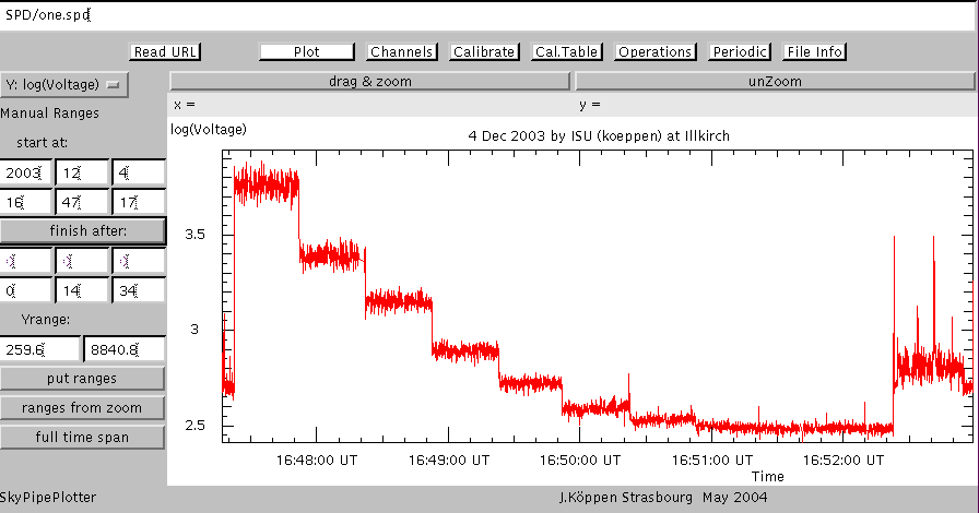
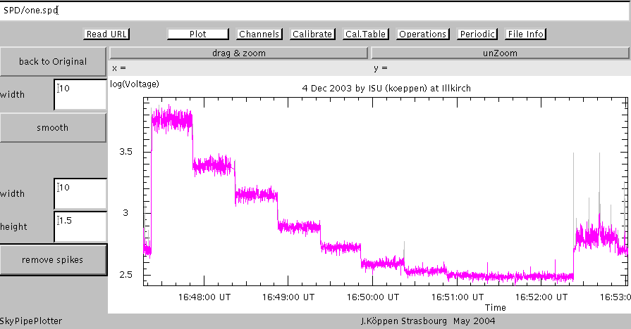
The following screen gives a zoomed view of the calibration steps. The logarithmic
display shows the lower steps much better. Also we see that the full time span
is 14 min 34 sec, while the zoomed view shows only about 6 min.
Read URL
To load another file, simply enter in the long TextField at the top the filename,
which can be the complete URL of a file - e.g. on your own Web site -
and click Read URL.
Note that when loading a new file any
calibration done or
entered via the calibration table
is kept in the program and the new data can be shown based on that
earlier calibration.
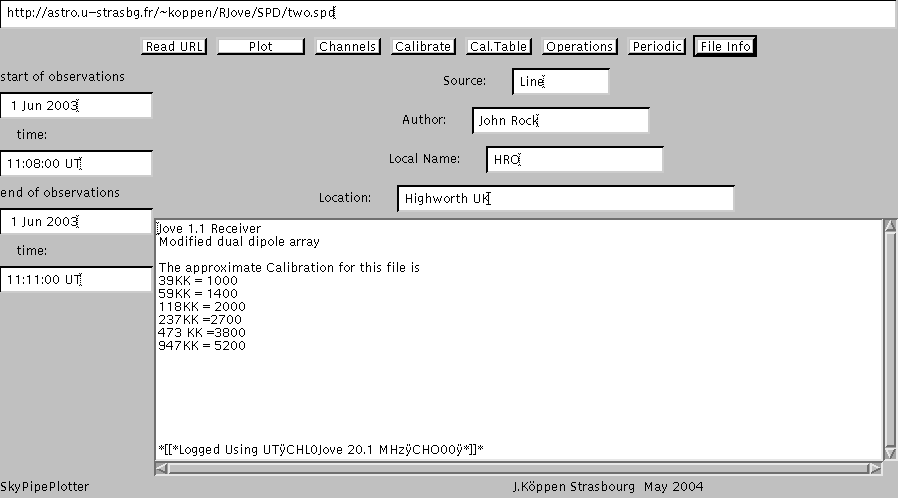
File info
All the details of the observations, stored in the file, are displayed on this
page. Note that I took another data set which had a more interesting content
than my example file...
Channels
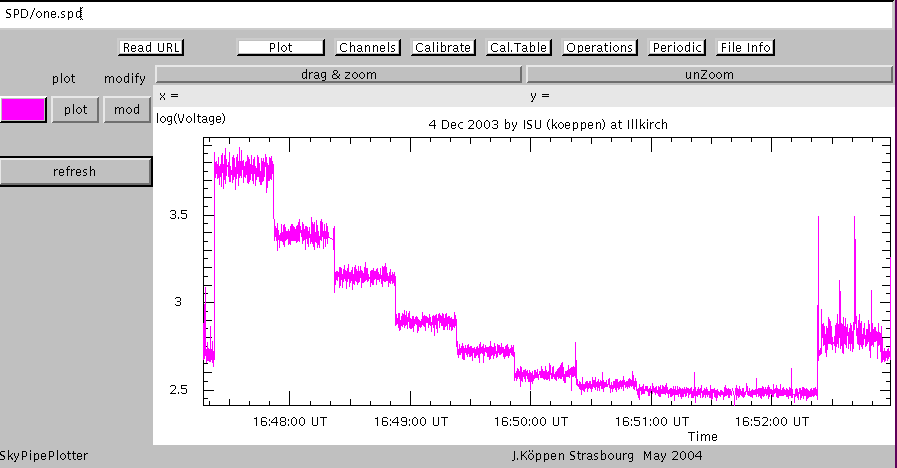
For each of the channels (maximum: 8) found in the SkyPipe file, we can
- choose the colour of the curve. Default is red.
Click on refresh to show the data in the chosen colour.
- select whether a channel is plotted (plot) or not.
Default is yes.
- select whether a channel can be modified (mod) or not.
Default is no.
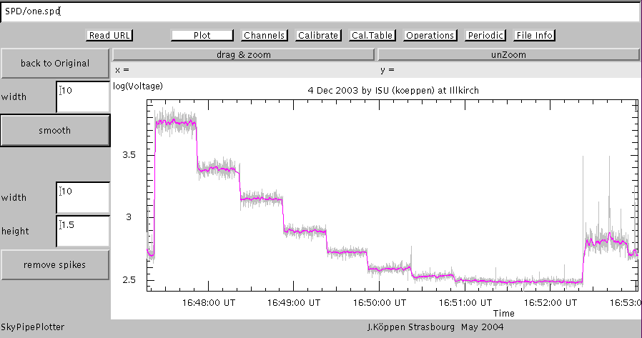
Here's an example of data with two channels, the red of which was despiked
and smoothed, as explained below:
Operations
If one or several channels have been selected to be modifyable, we may perform
some operations on them to improve the apprearence. For the moment, I have
available:
- remove spikes: clicking this button will remove all the narrow spikes.
The technique is to check every
datum whether it lies above a straight line connecting data width
pixels apart; if it does so by more than a factor (1+height)
of the current y-value, the datum is replaced by the value predicted
by the straight line.
- smooth: is done simply by averaging over the
width pixels left and right of each pixel.
- back to Original abandons all changes.
One simply fiddles with these three parameters, until one obtains what one
accepts as a nice result...
First we remove the spikes:
and then we smooth the curve (once or twice...)
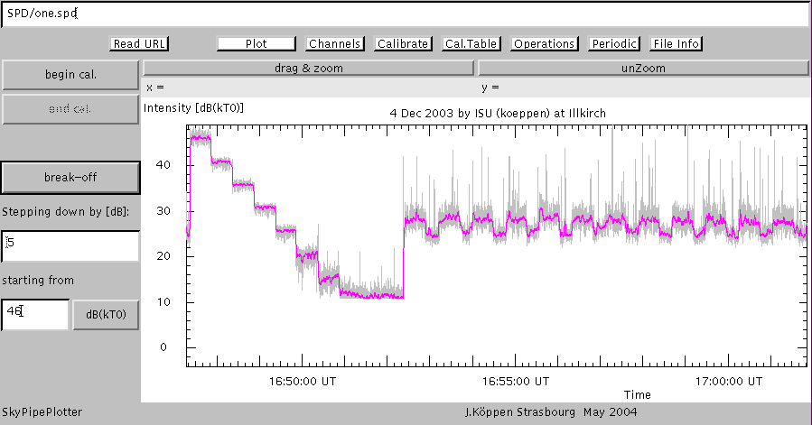
Calibrate
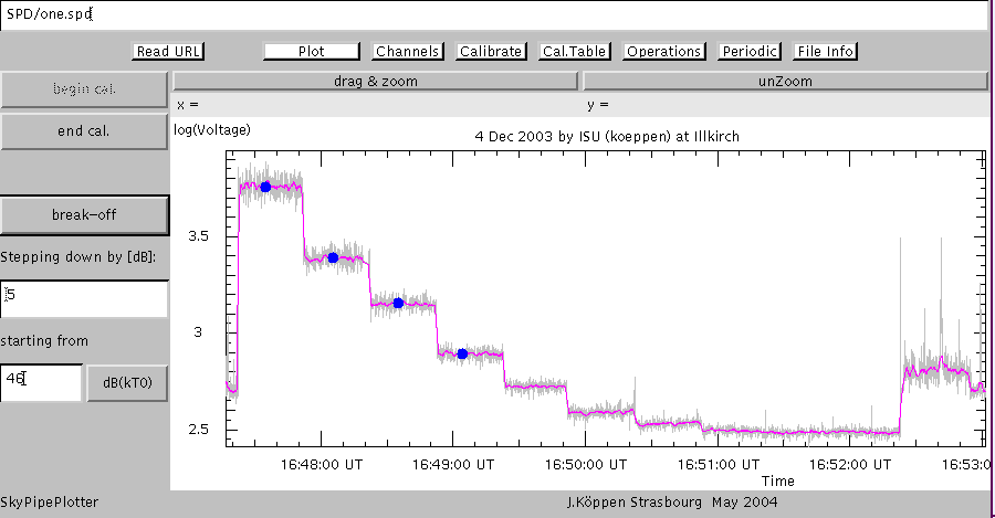
Here we use the calibration sequence to convert the voltages into noise temperatures.
This is done interactively: Having chosen a good view of the calibration steps -
and it helps to remove spikes and smooth the data, as we did - we
- choose between dB(kT0) if we know the calibration
steps in decibel above thermal
noise (as we shall do here) or kK if they are known
in thousands of Kelvin.
- starting from: enter the value for the maximum step (here: +46 dB(kT0))
- Stepping down by [dB] enter the value in decibels by how much each
step is lower than the other (here: 5 dB)
- begin cal. click this, then start at the top most step, click on each calibration
step, which then is marked with a blue dot, ...
- end cal. ... when done, click this, and the calibrated plot will be shown
- break-off allows to stop the calibration process at any time
Note that this calibration remains valid for any file loaded
afterwards.
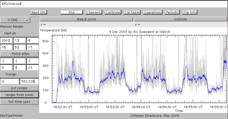
At the end, we get this view of the calibrated data, done in dB(kT0) [or in kK if
you had chosen it at the start]
Here is a zoomed view in linear temperatures in kK
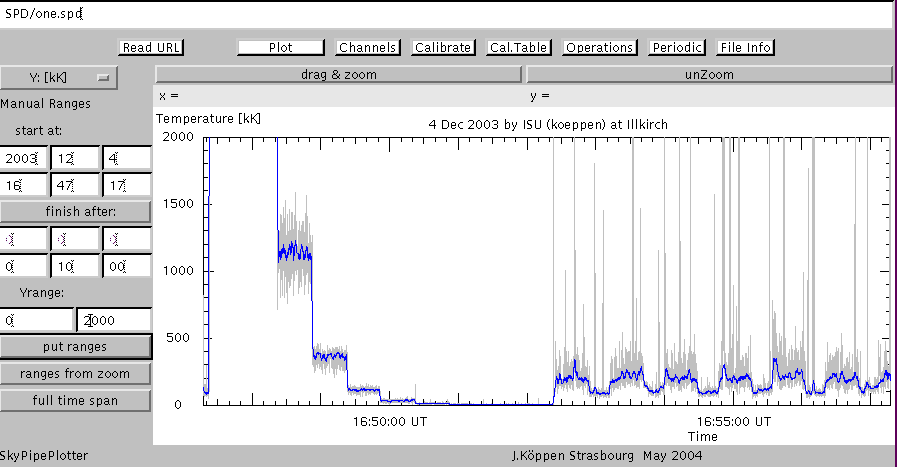
From this zoom we read off that during the low state of our interference we
have about 100 kK - which could be sufficient to pick up Jovian bursts -
but 200 kK during the high state!
Cal.Table
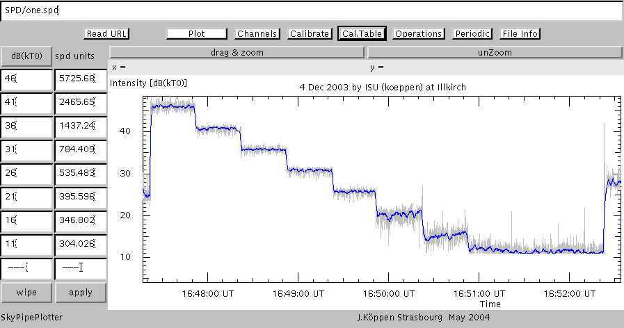
Here is a zoomed view of the calibration sequence, shown together with the
table which the program constructed from our interactive identification of
the calibration steps.
- we may switch between dB(kT0)
and kK
- we may alter any of the numerical values manually
- and apply them to the data
- wipe removes the entire table and thus the calibration
We could enter manually any calibration point data, such as given by
the observer in the file header or the labels.
This calibration is kept inside the program when you
load a new file.
Period
If one has a signal which appears to be periodic, we can measure its period
and also check whether it is strictly periodic:
- select the units of time sec or min or longer ...
- enter the suspected period - or better still: twice or thrice
that period
- refresh will show the data folded repeatedly into this
time interval
- back to full shows the entire time span again
The resultant plot shows that the period is close to 47 seconds, but that
the pulses do not follow with an exactly constant period. There is some
phase jitter ... So it seems unlikely that this signal is produced by a
quartz clock or a computer...
Some hints are necessary here to make life easier with this option:
First, in Plot select a zoomed view of the signal to be analyzed.
In particular, one has to leave sufficient space in the vertical direction.
Then, take the ranges from zoomand put ranges
to define the current unzoomed view. Note that if the channel was
modified by operations, only the modified signal is shown. Finally,
it is generally more sensible to select only one channel for plotting...
| Top of the Page
| Applet
| ISU RadioJove Home page
| my Home page
|