- Format of the records
- First looks
- Waterfall plot
- Subtraction of the Baseline
- Reduction to radial velocity
Format of the Data
The record file is a plain text file, and its contents may look like this
(from a manual observation):
The first line gives the geographical coordinates of the telescope, the next two
lines are the spectra taken at the current position; then follows the user's command
go to the next source G90 which is the Galactic Plene at longitude 90°. The
following lines are the spectra taken there ... except for the line right after the
command, since it took some time for the telescope to move to the new position.
For the sake of legibility of the Web pages, we have cut the line lengths, as indicated
by the dots ...
The results of observations in batch mode could look like this:
Here, the lines with * cmdfil: line simply record the commands from the batchfile,
so that we can recognize more easily what the data refers to. Also, in case of problems,
the error messages will be recorded.
The spectral data taken at each instant of time are recorded as a new line in
the file. The data are separated by blank spaces, the fields have this meaning:
A first look
Being in the form of a text file, the data can easily be imported into any suitable
program for data analysis, including a spread sheet program, such as MS Excel. In the
following, we use this program. Importing is done by: File > Import >
Text File > select your Text File > Delimited Text File > Delimiter is Spaces > Finish.
Now, each row (or line) represents a single spectrum taken at the time instant as
indicated by the column at left. The columns give the data as described above. It is
helpful to insert a row above the first spectrum, and type in what each column means.
If you deal with a file which recorded data taken at several different sources, it
is best to separate the data array of each source into its own worksheet.
Let us deal with a worksheet containing the spectra for a certain source. We shall
suppose that we had recorded several of many spectra for this source using the same
frequency grid. Before starting the analysis, it is best to have a first look at
the data.
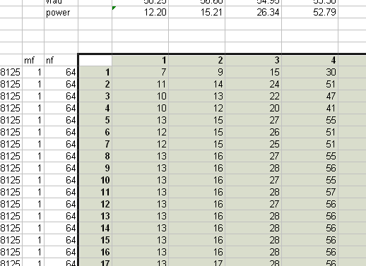
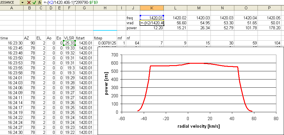
First, we should like to see what the overall average spectrum looks like. To do
this, we have to make rows that contain the abscissae and the ordinates for this plot:
The Waterfall plot
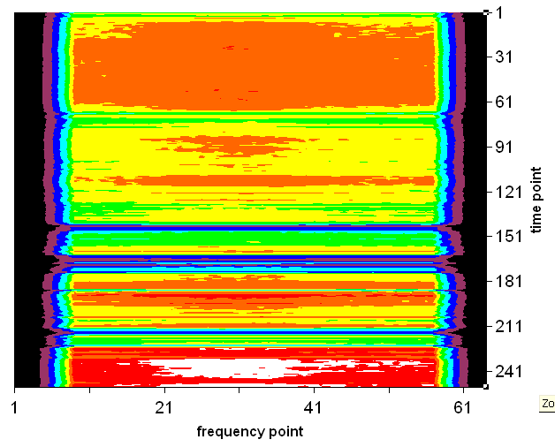
A good way to look at the data and judge its quality is the 'waterfall' map,
which shows the fluxes in a false-colour map as a function of both frequency
and time. This map is done in real-time by the telescope software, but it can
also be constructed afterwards from the recorded data. In Excel we have to use
a few small tricks:
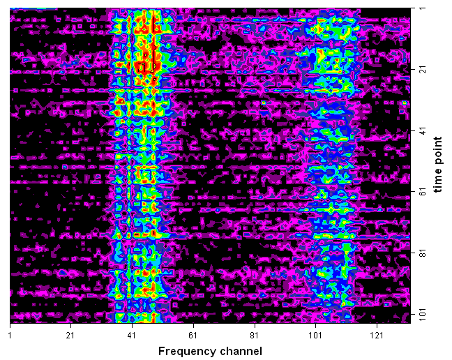
The map below shows the waterfall diagram of an in-band interference, consisting of
two signals. To bring out the details of the signals, we had subtracted from each
spectrum the background determined for that instant, and also show only some part
of the entire spectrum:
Subtraction of the Baseline
Since the radio signal from the celestial sources are rather weak, the spectrum
shows always some background signal, mainly from the noise generated by the receiver
itself. There may also be continuum radio emission from the sky, and unfortunately
also noise from the ever-growing electronic pollution by various electronic equipment,
such as computers and their switched power supplies. This essentially frequency-independent
noise power simply adds up to the received signals at all frequencies. Therefore we may
deal with it by simply subtracting this background, or the baseline as it is called
in radio spectroscopy.
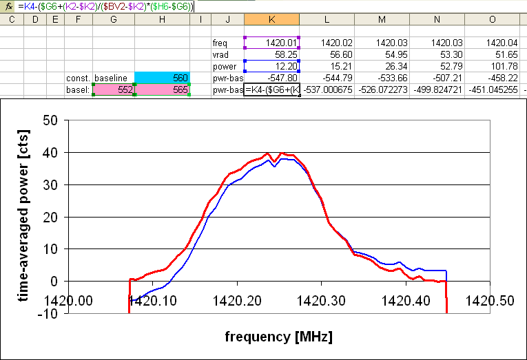
If the baseline is constant in frequency, it suffices to determine its level by
measuring it left and right of the spectral feature of the source, and subtract
the average value from the data. Let us do this for our above example. First, we
apply this to the time-averaged spectrum:
In this way, one obtains the true spectrum of the source. Integration over
all frequencies then gives the emission from the source.
Reduction to radial velocity
For galactic and extra-galactic sources, the frequency is not the physically relevant
of interessant quantity. It rather is the radial velocity. This is obtained from comparing
the frequency to that of the natural frequency of the hydrogen line,
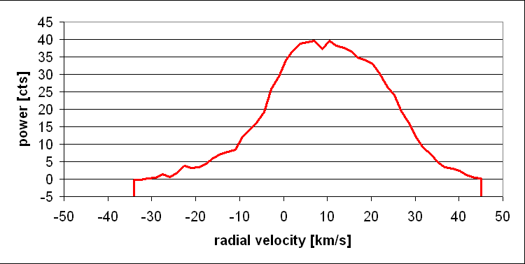
namely f0 = 1420.406 MHz:
| Top of the Page
| Back to the MainPage
| to my HomePage
|
last update: Apr. 2010 J.Köppen
* STATION LAT=48.52 DEG LONGW=-7.74
18:47:48 313.6 46.6 0 0 6.26 1420.16 0.00781250 1 64 3.3 3.8 6.8 15.8 ...
18:47:49 313.3 46.8 0 0 6.48 1420.16 0.00781250 1 64 3.2 4.5 6.5 13.3 ...
* G90
18:47:50 313.6 46.6 0 0 6.26 1420.16 0.00781250 1 64 3.7 4.0 7.0 12.5 ...
18:47:51 316.0 24.9 0 0 -7.29 1420.16 0.00781250 1 64 5.7 4.3 6.7 14.6 ...
18:47:52 316.0 24.9 0 0 -7.29 1420.16 0.00781250 1 64 6.9 4.3 8.1 15.8 ...
... and so on ...
* STATION LAT=48.52 DEG LONGW=-7.74
* cmdfil: line 6 : record
23:40:30 147.0 39.3 0 0 2.82 1419.43 0.00781250 6 248 5.0 6.0 11.0 21.0 42.0 ...
* cmdfil: line 7 : pointcorr -0.5 -3.5
* cmdfil: line 9 : galactic 220 0
23:41:20 145.5 25.9 0 0 2.28 1419.43 0.00781250 6 248 2.0 3.0 4.0 8.0 16.0 29.0 ...
* cmdfil: line 10 :360
23:41:36 145.7 26.1 0 0 2.35 1419.43 0.00781250 6 248 2.0 3.0 5.0 9.0 17.0 30.0 ...
23:41:49 145.7 26.1 0 0 2.33 1419.43 0.00781250 6 248 2.0 3.0 4.0 9.0 17.0 30.0 ...
.... and so on
In the above example, we see that the recording was switched on, one spectrum follows,
then the values for the pointing correction were accepted, then came the command to
goto the position with galactic longitude 220° and latitude 0°, one more spectrum follows,
and then came the request to stay at that position for 300 seconds. The following spectra
thus are the relevant observational data ...
mode = 0: refers to the SRT analog receiver, which is not operational here.
mode = 1 ... 6 refer to the spans of 0.5, 0.25, 0.12, 1.2, 1.5, and 2 MHz
mode = 9: is the frequency scan mode
Now select these two arrays and insert a Scatter Plot, which could look
like this
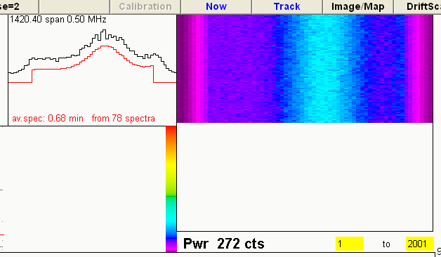
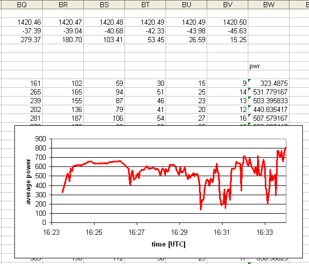
This map shows that the flux is greatest near the centre of the spectral range
(frequency no.31) and that for instance, just before time no.151 the fluxes dropped
sharply, as we had seen in the drop of frequency-averaged flux at 16:30.
